Quick Tips for Creating a Mobile Optimized Site
Last year mobile web usage increased 148% worldwide. In the near future as smarthpones become more and more ubiquitous this number will continue to shoot up. As a developer, the time has arrived for you to seriously consider whether you should begin accommodating your mobile audience.Today we’ll look at a few quick ways to make your site a little friendlier for mobile devices.
Analyze Your Audience
One thing to keep in mind is that if this number is super low, it might be partially due to the current poor state of your site on mobile devices. Make a decision regarding whether you want to simply improve the experience of your current mobile users or actively seek more mobile users by launching a dedicated mobile site, web app or iPhone app.
Create Mobile Stylesheets

Media Types
Using different media type declarations allows you to assign different stylesheets for certain uses. Most desktop browsers recognize “screen” while many mobile devices use the “handheld” command. Check out the following example:Using this simple declaration, you can create a handheld.css file that will only be activated on handheld devices (at least those that allow styling). This of course won’t work on every device, but it will hit a decent amount. Some developers even go so far as to suggest using this method with an empty stylesheet just to reset everything and make it simple for mobile viewing.
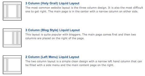
Use Fluid Layouts
Unfortunately, it’s not easy to discover how your layout will look on all mobile browsers as there are far too many devices to be able to track them all. One way you can bypass this problem is to use fluid layouts that will automatically adjust to the screen size.One way to accomplish this is to avoid setting widths in pixels and shoot for percentages or ems instead. For instance, instead of
simply use
To download some great pre-built fluid mobile layouts, check out the article below:
Perfect multi-column CSS liquid layouts – iPhone compatible
Hide Unnecessary Content

Insert the following CSS for any element that you wish to hide:
Properly Sizing Images
Large images may or may not display properly in mobile browsers and you can bet they’ll really bog down a mobile site. It’s a good practice to size them down either on the server or using CSS using the max width command. Just keep in mind that the latter is a bit more processor intensive and can take some time to load.Making sure images aren’t too large isn’t your only problem. As stated in the previous tip, clickable areas need to be rethought as well. Many mobile devices use a finger as the primary input device, which is considerably less accurate than a mouse and pointer. Because of this, any images that serve as buttons or links require consideration and possibly resizing to ensure they are easily selectable with a point and touch instead of a point and click. Unsure about how big to make a button? Look at the size of your own fingertip as an indicator for whether or not an image can easily be selected on a mobile device.
Interactivity
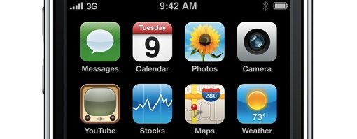
Sometimes adding a few interactive elements to a site make it much more enjoyable and less static/boring. However, on the mobile optimized version of your site, cut down the interactivity to a minimum (unless of course you’re creating a game or something similar). Interaction can easily go wrong on mobile devices and leave your users frustrated with all the work they have to do. Look for places to cut back on the input you require from users, especially in the area of text entry as using tiny keyboards can be among the worst parts of the mobile web experience.iPhone Specific Techniques
Adding a Home Screen Icon
iPhone and iPod Touches have a built-in feature that allows users to add your site to their home screen as an icon. You can customize this icon simply by placing a file in your root directory titled “apple-touch-icon.png” (make sure the image is at least 57×57). Alternatively, you can place the following snippet in your HTML:Obviously, you’ll customize the file path and name for your own image.
Viewport: Default Zoom
Your site might have built-in white space that looks great on a desktop but this will add an extra zoom in step for iPhone users who don’t wish to see that white space because it cuts down the readability and size of the main content. Use the following snippet to automatically zoom into the width of your content.The “width=320;” determines the magnification level of the content. Set this number to whatever is appropriate for your content (320 pixels is the width of the iPhone screen in a vertical orientation).
iPhone Specific Stylesheet
If you want to create CSS that only applies to your iPhone users, use the following code:This targets only devices with a maximum screen width of 480 pixels, namely iPhones and iPod Touches.
Mobile Site Builders
There are a few sites out there that help you create a mobile site with little to no knowledge of HTML and CSS. The most promising of these in my opinion is Mobify, but I’ve thrown in a few alternatives as well. If you’ve tried any of these (or others), let us know the pros and cons and your overall impression.Mobify

Mofuse

Wirenode

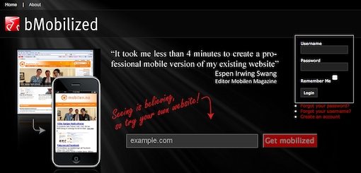
bMobilized
Zinadoo

Further Reading
Check out these other great articles for creating mobile optimized sites. Each of these helped me in my research and are full of additional information.- How to Make Your Website Mobile Friendly
- The 5-Minute CSS Mobile Makeover
- Make your Website Mobile and iPhone Friendly
- 7 Tips To Make Your Web Site Mobile-friendly
- 6 Tips to Optimize Your Website for iPhone
- Making a website iPhone-friendly using CSS
- Principles and Guidelines for Creating Great iPhone Content