How to Use the Pantone Color of the Year in Design Projects
So Pantone threw us a curveball this year and announced a pair of colors as the “Color of the Year” for 2016. To create the actual hue, Pantone is blending Rose Quartz and Serenity.This pairing of soft colors will likely be one of the color trends of the coming year. As with previous Pantone selections, the colors often become a staple in design, fashion and other projects. Pastels can be a little uncomfortable to work with for some designers. But today we’re going to take a look at ways you can make the most of these colors in your design projects.
Rose Quartz and Serenity
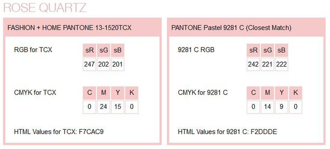
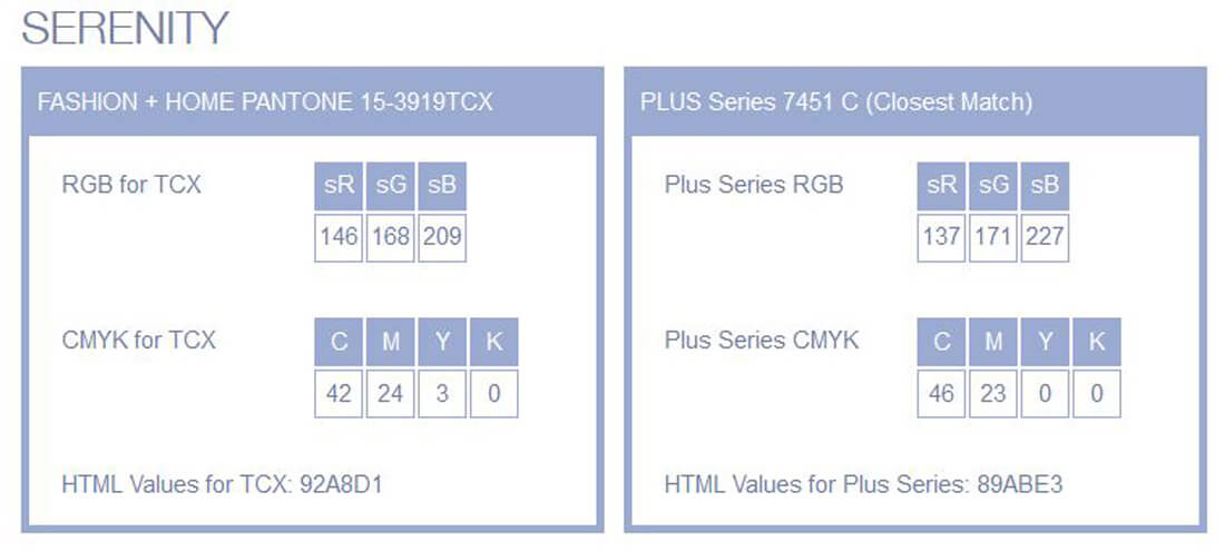
Here’s how Pantone defined the selection:
“As consumers seek mindfulness and well-being as an antidote to modern day stresses, welcoming colors that psychologically fulfill our yearning for reassurance and security are becoming more prominent. Joined together, Rose Quartz and Serenity demonstrate an inherent balance between a warmer embracing rose tone and the cooler tranquil blue, reflecting connection and wellness as well as a soothing sense of order and peace.
“The prevalent combination of Rose Quartz and Serenity also challenges traditional perceptions of color association.
“In many parts of the world we are experiencing a gender blur as it relates to fashion, which has in turn impacted color trends throughout all other areas of design. This more unilateral approach to color is coinciding with societal movements toward gender equality and fluidity, the consumer’s increased comfort with using color as a form of expression, a generation that has less concern about being typecast or judged and an open exchange of digital information that has opened our eyes to different approaches to color usage.”
Rose Quartz
Rose Quartz is a pale pink, much like the color associated with baby girls and new life.- Pantone: 9281 C
- RGB: 242 R, 221 G, 222 B
- CMYK: 0 C, 14 M, 9 Y, 0 K
- HTML: F2DDDE
Serenity
Serenity is a baby blue hue that’s a little more on the purple side than green.- Pantone: 7451 C
- RGB: 137 R, 171 G, 227 B
- CMYK: 46 C, 23 M, 0 Y, 0 K
- HTML: 89ABE3
Background Shading
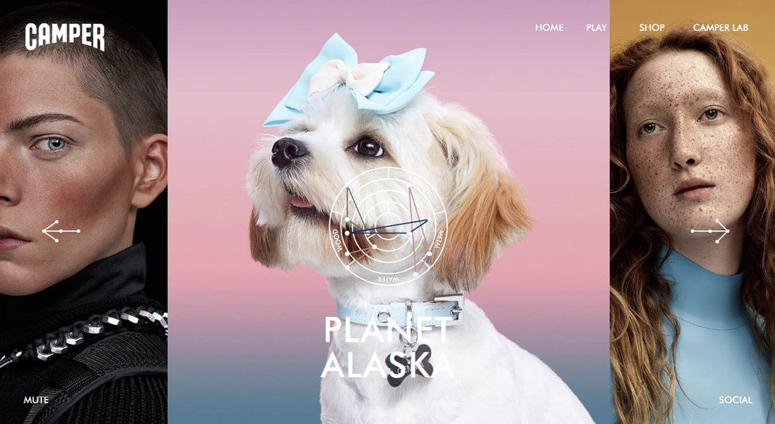
Pantone’s Color of the Year can make a great background. The color combination is one that’s found in nature if you picture the evening sky at dusk, filled with pinks and blues. As a background shade, you can make the most of this color association for natural environments.
The colors, because of their pastel nature, are also good as a tone setting backdrop because the colors almost fade into the background and won’t detract from foreground elements or imagery.
The example from Camper above exemplifies usage of Rose Quartz and Serenity. Take note of the beautiful fade between hues to accent the foreground image of the dog. The colors work to create a peaceful look that works with the white dog, not against it.
Imagery and Color Overlay
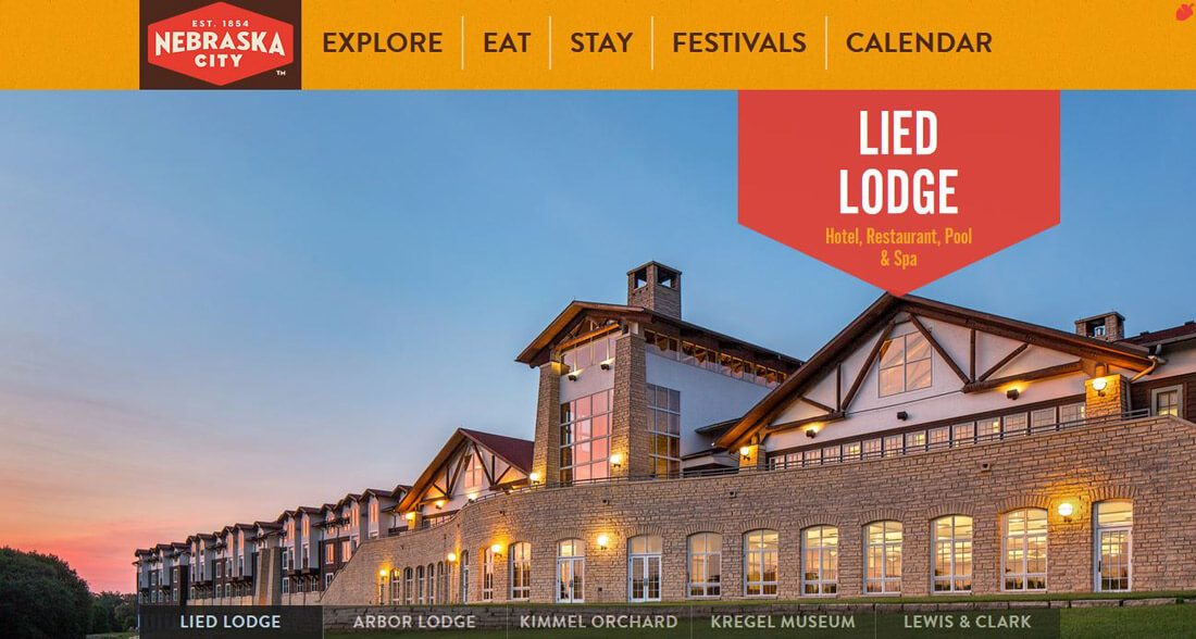
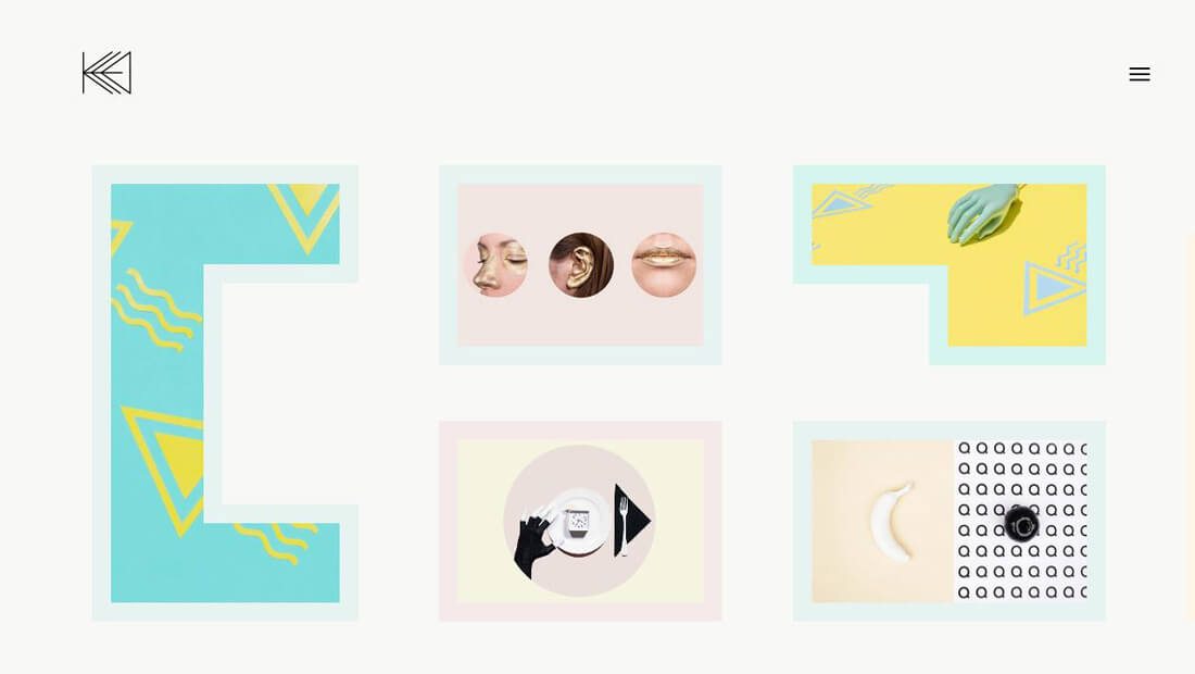
One of the easiest ways to use these colors is in your dominant imagery. From photos to illustrations, Rose Quartz and Serenity can be incorporated into the design without forcing it. The examples above showcase how the color combination can show spectacular in a photograph (Nebraska City) or as coloring in a more artistic display (Kata Farkas).
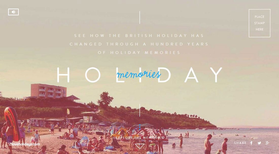
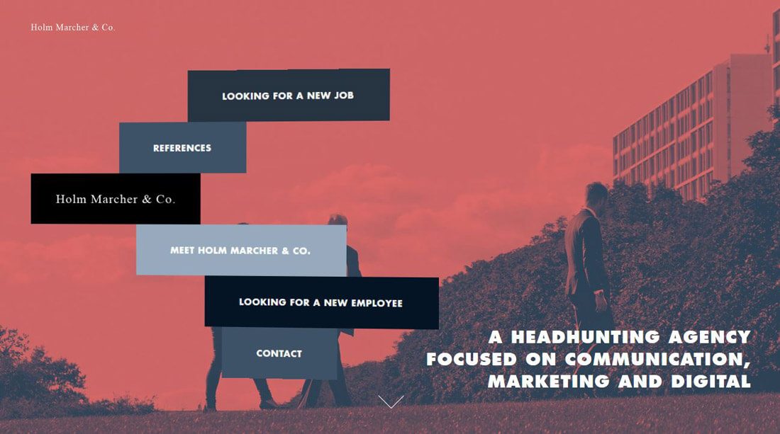
Another option is to use the hues to create a warm or cool color overlay. The Holiday Memories site is masterfully done using the pinker tone to cover the entire image with blue text accents. This combination feels inviting thanks to the photo treatment and cool and wintery because of the text color and treatment. The colors work together to create a yin and yang effect with just the right feel.
Accents and Elements
While most frequently, you may think of using red for a button color, a softer hue might be the answer. Pastels can work for button design too, especially when the elements or calls-to-action are a bit oversized. Blue buttons are already a common option and making the change to a color that is close to Serenity would be an easy change to make.
A fun option would be to combine the colors as Pantone suggests by naming a Color of the Year pair by creating a gradient from the colors for a button or other elements.
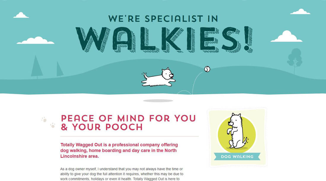
Depending on the overall aesthetic, either of these hues could be used for text elements (especially on a dark background) or for links or bold lettering styles. Note how the site above uses multiple variations of similar pinks and blues for elements including the tiny paws to the left of the text.
Color Variations
While you may be eager to use these colors in projects, they might not fit everything you are working on. That’s where using variations of the hues might be better suited. Consider adding black for a darker aesthetic or white to create an even softer set of pastels.
What’s fun about things like the Color of the Year, is seeing where this trend will take us. It’s up to you to chart that course. Don’t feel like the only way to be a part of the trend is to use the exact color matches, but experiment and create something that is your own.
Inspiration from the Design Shack Gallery
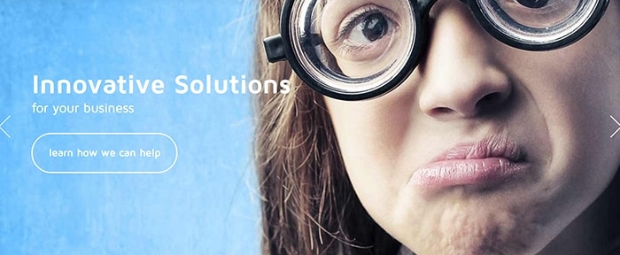
The Design Shack gallery is packed with examples – and you can search by color – to see what others are doing with these colors. Here are a few projects to help you think about how you might use pinks and blues.Byanise
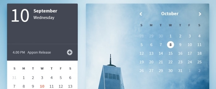
Appon Calendar
Mel Louie
Melodrama Boutique
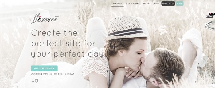
FForever
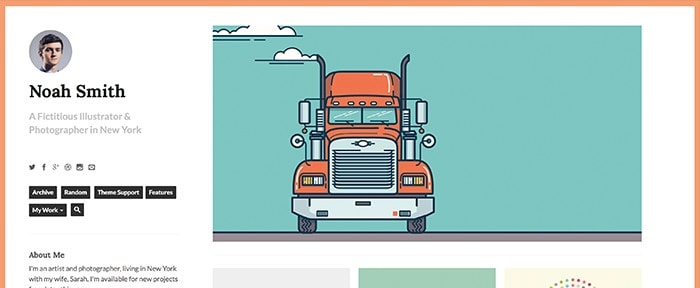
NeatFolio
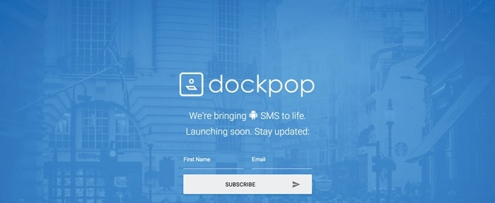
Dockpop

EmoticonEmoticon