Duotone Color: Tips & Examples for This Vibrant Trend
The next big web design image trend is here, and it’s vibrant, colourful, and beautiful!Thanks to Spotify, duotone is growing in popularity almost daily. The effect, which uses a pair of colors over a photo is striking, fun and vibrant. It’s also quite trendy, with new sites changing to a duotone format almost daily. Here are a few ways to make the most of this hot design technique.
What is Duotone?
First, a little primer: Duotone is the use of two colors.
The name and technique comes from printing presses. Duotone prints are made in two shades of the same color or with black and one tint. The process uses two color plates made with the screen set at different angles.
The two-color concept is big. Pantone named a pair as Color of the Year, minimalism had designers thinking about limited palettes and duotones are visually interesting and fairly easy to create. You can create the effect using Adobe Photoshop and a two-color gradient or a tool such as Colofilter.css to apply it in the code.
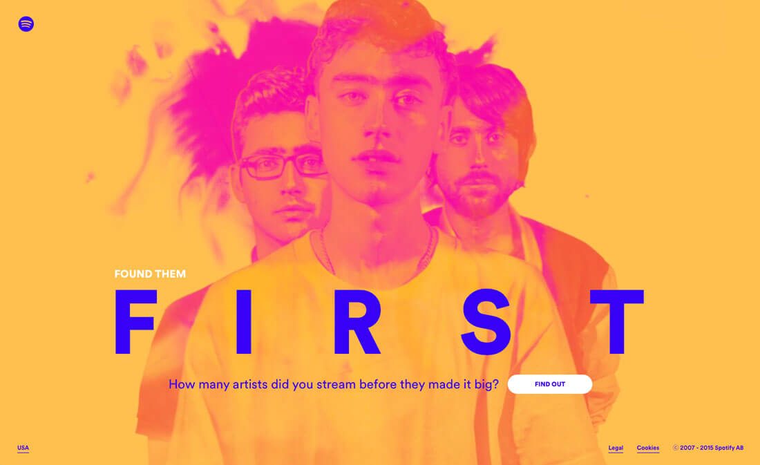
But what likely helped duotone off the ground the most is usage by Spotify. Duotone color schemes are used in the music playing app and for various promotional micro-sites. Duotone adds a unique design element to images from artists that are well-known and widely-used.
The technique that was once a print staple has found new life online, and is a trend that we are likely to see a lot more of in the months to come.
As a Dominant Image
Use duotone to create a dominant image.
The main visual for New Deal Design is striking thanks to a bold color choice and quirky, thanks to the fun imagery and color. Don’t be afraid to go outside your comfort when it comes to working with duotone images; it’s ok to pair hues that might not match. The goal is to create a visual that demands attention and includes plenty of contrast for the image to show through.
Here are a few tips for maximum impact:
- Pick two contrasting colors or pair brand colors.
- Select a photo with a focused image area. A landscape might be difficult to use.
- Start with a high quality image. Blurry or poor images and duotone don’t mix.
- Play up contrast.
- Consider spaces for buttons or typography.
- Pick colors that reflect the mood of the photo.
- Set a duotone image off with a colored border or mix and match color options with a scrolling slider or parallax effects.
As a Simple Color Palette
Duotone does not have to be complicated. Sometimes the most striking two-color projects are simple in nature.
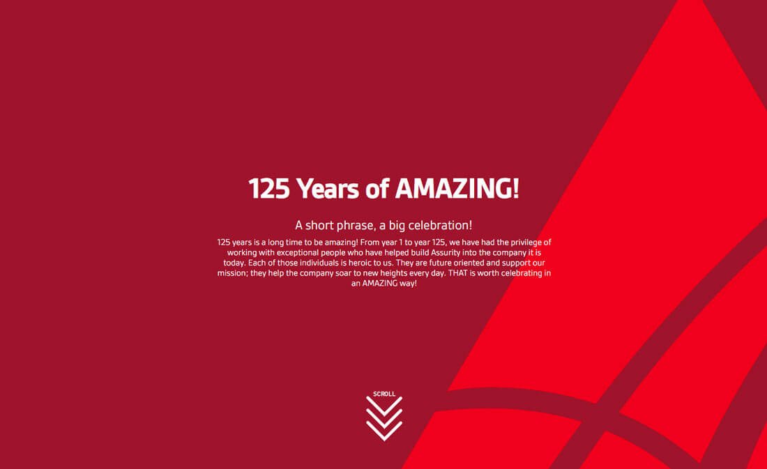
Assurity Life Insurance uses a pair of reds and clean typography. The scroll includes a more halftone style as well. The colors are bright and engaging. Red is the kind of color that almost makes users look at it.
The trick here is that it is just simple enough to be effective. The user is not overwhelmed with elements. The red draws you in so that the words on the screen become the focus. This type of duotone effect is almost made for websites that have a more formal look and feel because it allows use of a trend without feeling forced or overwhelming.
As a Way to Increase Readability
Use duotone to act as a color stabilizer that gives the text plenty of space and contrast. A duotone color overlay can help “flatten” color variations in an image so that text can be placed using a single color almost anywhere on the image and still be readable.
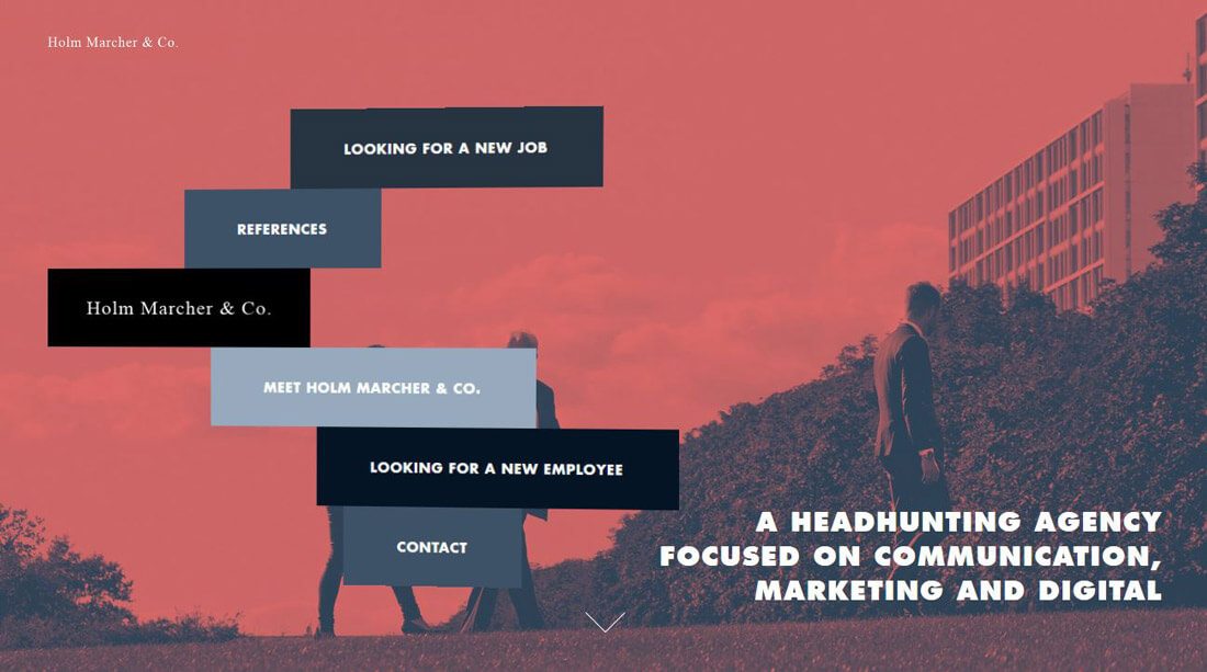
Duotone color choices won’t be as bright for this use and will likely appear more muted, but can serve a great purpose. Holm Marcher & Co. does this with a coral and blue duotone that is interesting and creates a highly readable backdrop for lettering. As an added bonus, navigational elements use shades of blue from the color palette to encourage moving around the site.
As an Accent
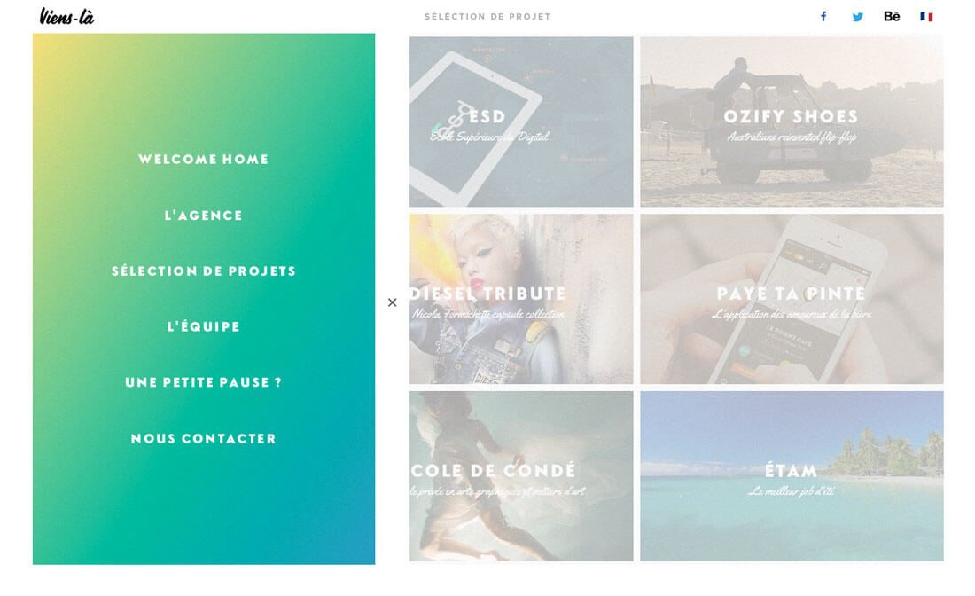
While duotone effects lend themselves to large images, they can work in smaller places as well. Consider a duotone accent in the navigation, for secondary images or for specific types of content.
What’s nice about smaller areas of duotone is that you have a little more freedom to play if you are intimidated by the technique or aren’t quite sure how to make it work for you. When used in smaller spaces, it can be visually interesting to play with multiple color pairs for different elements in the design.
Consider duotone elements for card style elements, as an overlay for links for video or to emphasize calls to action. Duotone accents can also be effective tools for use in a minimal or black and white color scheme because of the color contrast they create.
As a Background
There’s nothing like a subtle duotone effect to create an interesting background image or pattern. This is an ideal use for brand colors or as a way to incorporate a trendy hue or technique into your design without a full-scale overhaul.
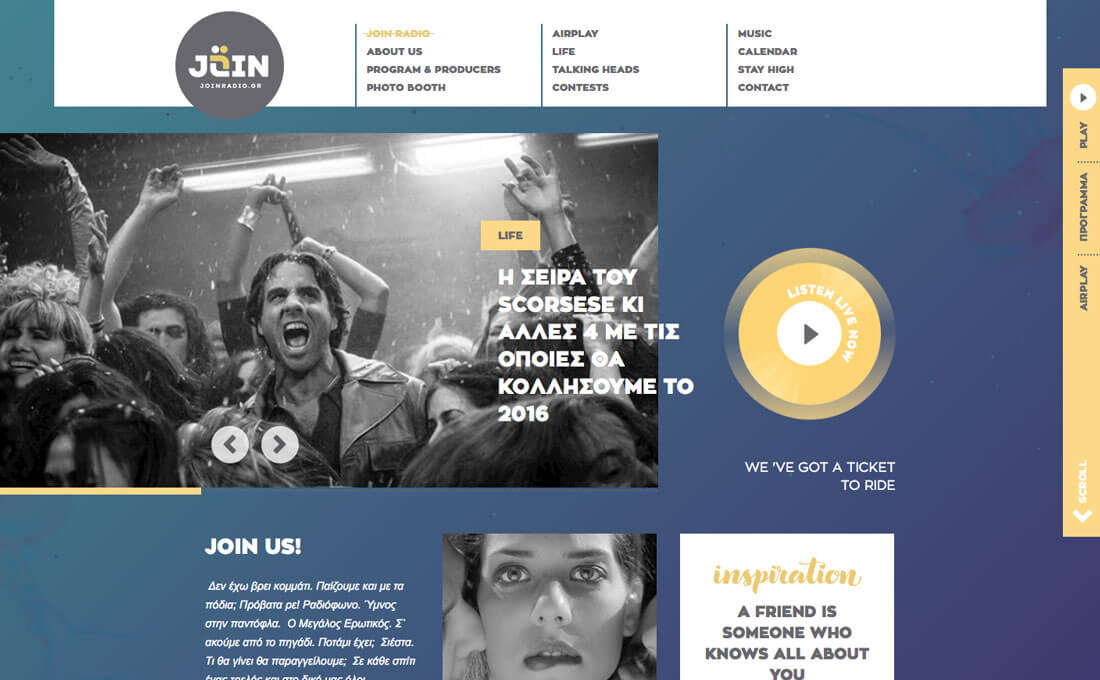
The graduated duotone background for Join Radio is perfection. The color change is almost unnoticeable and blends seamlessly with other user interface elements in the design. There’s a simple animation moving through the colors that is soothing and has a water-like motion to it. The shift from light to dark follows natural eye and reading patterns that move from the top left of the homepage to the bottom right, where the user is further encourage to scroll and click.
Conclusion
It’s hard to find a design technique that’s more fun to play with than color. Duotones are equally engaging for designers. The effect can spice up an overused image, add a fun element when one is lacking and just help engage users visually.Plus, you the designer really get to experiment when using duotone effects. You can pair colors that you might not have imagined for a major impact or combine colors with subtle variations for a small element of surprise. Either way, creating this color effect almost always looks custom and can be fun to work with.Duotone Color: Tips & Examples for This Vibrant Trend
The next big web design image trend is here, and it’s vibrant, colourful, and beautiful!
Thanks to Spotify, duotone is growing in popularity almost daily. The effect, which uses a pair of colors over a photo is striking, fun and vibrant. It’s also quite trendy, with new sites changing to a duotone format almost daily. Here are a few ways to make the most of this hot design technique.
Thanks to Spotify, duotone is growing in popularity almost daily. The effect, which uses a pair of colors over a photo is striking, fun and vibrant. It’s also quite trendy, with new sites changing to a duotone format almost daily. Here are a few ways to make the most of this hot design technique.
What is Duotone?
First, a little primer: Duotone is the use of two colors.
The name and technique comes from printing presses. Duotone prints are made in two shades of the same color or with black and one tint. The process uses two color plates made with the screen set at different angles.
The two-color concept is big. Pantone named a pair as Color of the Year, minimalism had designers thinking about limited palettes and duotones are visually interesting and fairly easy to create. You can create the effect using Adobe Photoshop and a two-color gradient or a tool such as Colofilter.css to apply it in the code.
But what likely helped duotone off the ground the most is usage by Spotify. Duotone color schemes are used in the music playing app and for various promotional micro-sites. Duotone adds a unique design element to images from artists that are well-known and widely-used.
The technique that was once a print staple has found new life online, and is a trend that we are likely to see a lot more of in the months to come.
As a Dominant Image
Use duotone to create a dominant image.
The main visual for New Deal Design is striking thanks to a bold color choice and quirky, thanks to the fun imagery and color. Don’t be afraid to go outside your comfort when it comes to working with duotone images; it’s ok to pair hues that might not match. The goal is to create a visual that demands attention and includes plenty of contrast for the image to show through.
Here are a few tips for maximum impact:
- Pick two contrasting colors or pair brand colors.
- Select a photo with a focused image area. A landscape might be difficult to use.
- Start with a high quality image. Blurry or poor images and duotone don’t mix.
- Play up contrast.
- Consider spaces for buttons or typography.
- Pick colors that reflect the mood of the photo.
- Set a duotone image off with a colored border or mix and match color options with a scrolling slider or parallax effects.
As a Simple Color Palette
Duotone does not have to be complicated. Sometimes the most striking two-color projects are simple in nature.
Assurity Life Insurance uses a pair of reds and clean typography. The scroll includes a more halftone style as well. The colors are bright and engaging. Red is the kind of color that almost makes users look at it.
The trick here is that it is just simple enough to be effective. The user is not overwhelmed with elements. The red draws you in so that the words on the screen become the focus. This type of duotone effect is almost made for websites that have a more formal look and feel because it allows use of a trend without feeling forced or overwhelming.
As a Way to Increase Readability
Use duotone to act as a color stabilizer that gives the text plenty of space and contrast. A duotone color overlay can help “flatten” color variations in an image so that text can be placed using a single color almost anywhere on the image and still be readable.
Duotone color choices won’t be as bright for this use and will likely appear more muted, but can serve a great purpose. Holm Marcher & Co. does this with a coral and blue duotone that is interesting and creates a highly readable backdrop for lettering. As an added bonus, navigational elements use shades of blue from the color palette to encourage moving around the site.
As an Accent
While duotone effects lend themselves to large images, they can work in smaller places as well. Consider a duotone accent in the navigation, for secondary images or for specific types of content.
What’s nice about smaller areas of duotone is that you have a little more freedom to play if you are intimidated by the technique or aren’t quite sure how to make it work for you. When used in smaller spaces, it can be visually interesting to play with multiple color pairs for different elements in the design.
Consider duotone elements for card style elements, as an overlay for links for video or to emphasize calls to action. Duotone accents can also be effective tools for use in a minimal or black and white color scheme because of the color contrast they create.
As a Background
There’s nothing like a subtle duotone effect to create an interesting background image or pattern. This is an ideal use for brand colors or as a way to incorporate a trendy hue or technique into your design without a full-scale overhaul.
The graduated duotone background for Join Radio is perfection. The color change is almost unnoticeable and blends seamlessly with other user interface elements in the design. There’s a simple animation moving through the colors that is soothing and has a water-like motion to it. The shift from light to dark follows natural eye and reading patterns that move from the top left of the homepage to the bottom right, where the user is further encourage to scroll and click.
Conclusion
It’s hard to find a design technique that’s more fun to play with than color. Duotones are equally engaging for designers. The effect can spice up an overused image, add a fun element when one is lacking and just help engage users visually.Plus, you the designer really get to experiment when using duotone effects. You can pair colors that you might not have imagined for a major impact or combine colors with subtle variations for a small element of surprise. Either way, creating this color effect almost always looks custom and can be fun to work with.The next big web design image trend is here, and it’s vibrant, colourful, and beautiful!
Thanks to Spotify, duotone is growing in popularity almost daily. The effect, which uses a pair of colors over a photo is striking, fun and vibrant. It’s also quite trendy, with new sites changing to a duotone format almost daily. Here are a few ways to make the most of this hot design technique.What is Duotone?
First, a little primer: Duotone is the use of two colors.
The name and technique comes from printing presses. Duotone prints are made in two shades of the same color or with black and one tint. The process uses two color plates made with the screen set at different angles.
The two-color concept is big. Pantone named a pair as Color of the Year, minimalism had designers thinking about limited palettes and duotones are visually interesting and fairly easy to create. You can create the effect using Adobe Photoshop and a two-color gradient or a tool such as Colofilter.css to apply it in the code.
But what likely helped duotone off the ground the most is usage by Spotify. Duotone color schemes are used in the music playing app and for various promotional micro-sites. Duotone adds a unique design element to images from artists that are well-known and widely-used.
The technique that was once a print staple has found new life online, and is a trend that we are likely to see a lot more of in the months to come.
As a Dominant Image
Use duotone to create a dominant image.
The main visual for New Deal Design is striking thanks to a bold color choice and quirky, thanks to the fun imagery and color. Don’t be afraid to go outside your comfort when it comes to working with duotone images; it’s ok to pair hues that might not match. The goal is to create a visual that demands attention and includes plenty of contrast for the image to show through.
Here are a few tips for maximum impact:
- Pick two contrasting colors or pair brand colors.
- Select a photo with a focused image area. A landscape might be difficult to use.
- Start with a high quality image. Blurry or poor images and duotone don’t mix.
- Play up contrast.
- Consider spaces for buttons or typography.
- Pick colors that reflect the mood of the photo.
- Set a duotone image off with a colored border or mix and match color options with a scrolling slider or parallax effects.
As a Simple Color Palette
Duotone does not have to be complicated. Sometimes the most striking two-color projects are simple in nature.
Assurity Life Insurance uses a pair of reds and clean typography. The scroll includes a more halftone style as well. The colors are bright and engaging. Red is the kind of color that almost makes users look at it.
The trick here is that it is just simple enough to be effective. The user is not overwhelmed with elements. The red draws you in so that the words on the screen become the focus. This type of duotone effect is almost made for websites that have a more formal look and feel because it allows use of a trend without feeling forced or overwhelming.
As a Way to Increase Readability
Use duotone to act as a color stabilizer that gives the text plenty of space and contrast. A duotone color overlay can help “flatten” color variations in an image so that text can be placed using a single color almost anywhere on the image and still be readable.
Duotone color choices won’t be as bright for this use and will likely appear more muted, but can serve a great purpose. Holm Marcher & Co. does this with a coral and blue duotone that is interesting and creates a highly readable backdrop for lettering. As an added bonus, navigational elements use shades of blue from the color palette to encourage moving around the site.
As an Accent
While duotone effects lend themselves to large images, they can work in smaller places as well. Consider a duotone accent in the navigation, for secondary images or for specific types of content.
What’s nice about smaller areas of duotone is that you have a little more freedom to play if you are intimidated by the technique or aren’t quite sure how to make it work for you. When used in smaller spaces, it can be visually interesting to play with multiple color pairs for different elements in the design.
Consider duotone elements for card style elements, as an overlay for links for video or to emphasize calls to action. Duotone accents can also be effective tools for use in a minimal or black and white color scheme because of the color contrast they create.
As a Background
There’s nothing like a subtle duotone effect to create an interesting background image or pattern. This is an ideal use for brand colors or as a way to incorporate a trendy hue or technique into your design without a full-scale overhaul.
The graduated duotone background for Join Radio is perfection. The color change is almost unnoticeable and blends seamlessly with other user interface elements in the design. There’s a simple animation moving through the colors that is soothing and has a water-like motion to it. The shift from light to dark follows natural eye and reading patterns that move from the top left of the homepage to the bottom right, where the user is further encourage to scroll and click.
Conclusion
It’s hard to find a design technique that’s more fun to play with than color. Duotones are equally engaging for designers. The effect can spice up an overused image, add a fun element when one is lacking and just help engage users visually.Plus, you the designer really get to experiment when using duotone effects. You can pair colors that you might not have imagined for a major impact or combine colors with subtle variations for a small element of surprise. Either way, creating this color effect almost always looks custom and can be fun to work with.


EmoticonEmoticon