Design Trend: Using Watercolor Patterns in Web Design
Add a little art to your web design with the watercolor trend. Watercolor techniques are a popular design option because they are fun, easy to use and work with a variety of different types of content.Watercolor styles can be used in a number of ways to emphasize your content. Whether you are considering a watercolor look for your website framework or just want to experiment with the style, we have a collection of ideas, examples and resources to help you get started.
Bright and Light
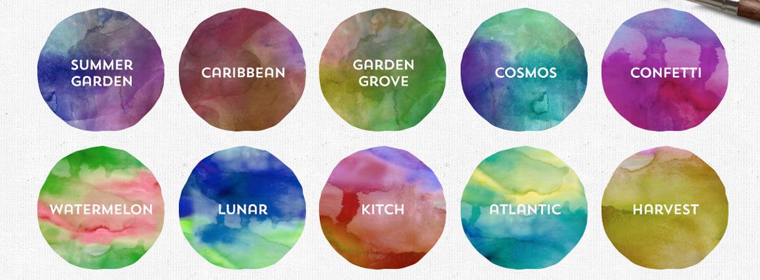
One of the great things about a watercolor style is that the way you “paint” the canvas can dictate how light or dark the elements are. Try a “thin” layer for a bright and light style that feels open and airy.
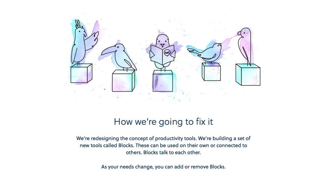
A few strokes in this manner can add a whole new dimension to a minimal style design or brighten up a stark canvas. Blocks app, for example, uses lovely swatches of color to fill in fun illustrations. The hint of watercolor and coloring outside the lines draws the eye and catches your attention immediately. It’s a style the company uses throughout the site design, from using water coloring in the logo, to the background of some pages to the whimsical drawings. It creates a nice tone between the site and user.
Whimsical
Watercolor styles often have a feel associated with whimsy – although that does not have to be the case. How brush strokes are used in the design can dictate that feel, as can animation or other subtle effects.
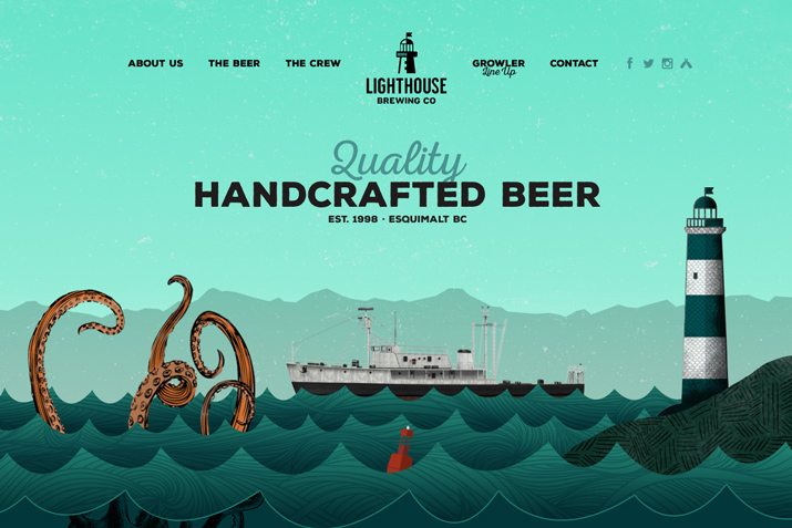
Lighthouse brewing uses a darker, more complete pointed-style illustration on its homepage that has just that whimsical feel thanks to the animated ocean and boat on the screen. Animations continue with the scroll and even the logo at the end has a watercolor feel to it (as does the background for the entire site). What this design shows is that you can break beyond what you think about watercolor to create something in the style that is a little unexpected.
Artistic
Show your inner artist with watercolor to create a full design that looks painted. While this might not work for every type of website, it is a fun alternative for some designers (and a great way to get your creative juices flowing). A watercolor scene can make a design feel one-of-a-kind, because the art is made for the content and appears to be created by hand.
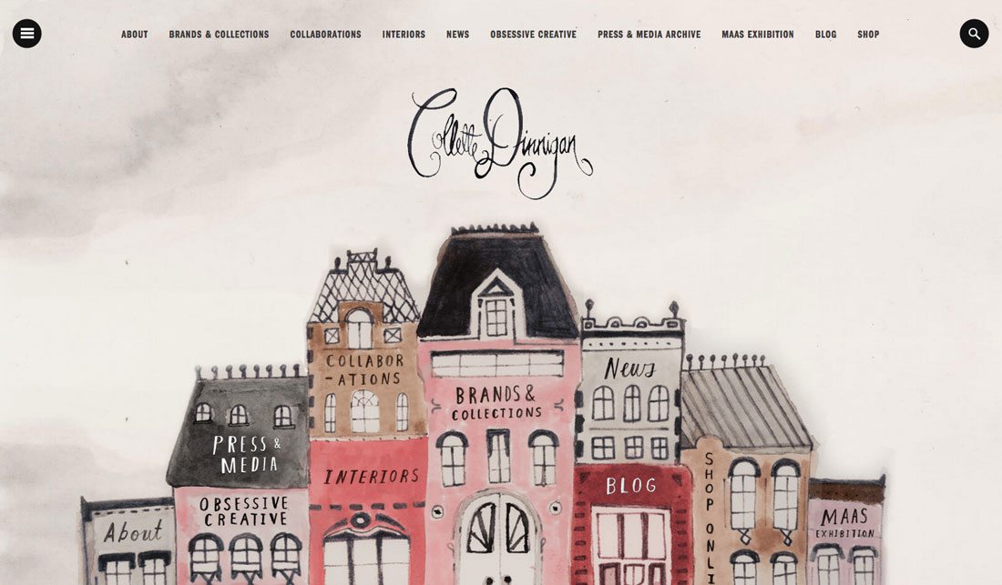
Collette Dinnigan’s site features a beautiful watercolor scene that takes you through her work. While you might not immediately think of watercolor for a portfolio site, it’s a fun and fresh option (especially for someone who incorporates painting into their work).
Pair with Fun Fonts
Because of the light nature of watercolor, this style is a fantastic compliment to fun or unusual typefaces. With lighter colors and patters, opt for thinner lighter typefaces to carry the feel or gold with thick bold strokes paired with darker, more saturated options.
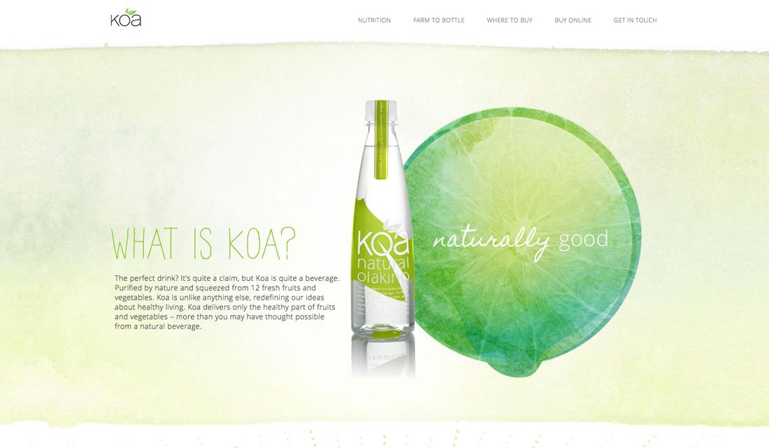
Koa uses a lime-colored watercolor background and hints of that same style in many of the site images. Type choices include an interesting handwriting style with a cursive option that is just as light as the color palette. An additional sans serif typeface pulls everything together with just enough straightforwardness that the retail site promoting a new drink feel trustworthy enough to buy from. One of the best uses of watercolor in the design is the map (which is also featured at the beginning of this article).
Using Watercolor
Now that we’ve looked at a few uses of watercolor in website design, it’s time to make this style usable in your projects. You can use watercolor elements as the main aesthetic for a project or combine watercolor styles with other elements for just a touch of the trend. The trick is using it with content where there is a match, because this style can get a little overwhelming.
Here are a few ways to get started with watercolor:
- Try a font
- Create a pattern
- Use a watercolor background
- Make watercolor the dominant image in artistic style
- Create a logo with watercolor elements
- Projects designed for kids
- Save the dates
- Event work
- Portfolios or artist pages
10 Watercolor Resources
Now that you are thinking seriously about watercolor, it’s time to get started. If you are not confident actually painting something – that can be a lot of fun –or creating a watercolor outline in design software, there are plenty of resources to help you get started. Here’s a collection of 10 elements from tutorials to kits to tools that can help you use watercolor styles right away.
- 30 Sets of Watercolor Brushes for Photoshop
- Video Tutorial: How to Use the Watercolor Brush in Illustrator
- The Complete Watercolor Branding Kit
- Blue Watercolor Background
- Watercolor Brushes and Textures
- Watercolor Social Media Logos
- Inspiration: “The Distinctive Watercolor Designs of Karen Kurycki”
- Wanderlust Watercolor Handwriting Typeface
- Watercolor Travel Banner Template
- Watercolor Design Bundle
EmoticonEmoticon