10 Tips for Designing HTML Emails
Love ’em or hate ’em, HTML emails are a wildly popular marketing tool and you will almost definitely come across clients that want you to build them.If you don’t know anything about HTML emails, they’re annoying to develop and break all the rules you’ve ever learned as a web designer, but being able to code them is a valuable skill to possess. Today we’ll look at ten quick and easy tips to get beginners started on the road to creating beautiful and functional emails.
#1 Use Tables
Wait what? Didn’t we abandon non-semantic table-based designs ages ago? Yep, and now you get to experience the joy all over again. Unfortunately, most email clients don’t support a plain old CSS layout like you’re used to. Instead, it’s back to the 90s and familiarizing yourself with cellspacing.If you’re unfamiliar with table-based layouts, here’s a simple example.
Each table is divided into rows with cells. Each row is represented by
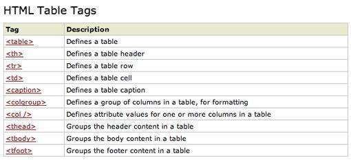
and each cell is represented by. Here’s a quick rundown from W3Schools of some available table-related tags.
Table Tools
If you want an easy way to build the basic structure of an HTML table, check out the free generators below.- TABLEIZER!: Converts spreadsheet data to HTML tables.
- Quackit Table Generator
- Accesify Table Builder
#2 Use Inline CSS
HTML emails do support limited CSS, but you can’t use an external style sheet. Instead, you use inline CSS to style the various elements in the tables.The snippet above shows you the basic syntax for inline CSS. As you can see, the code is essentially the same, you just embed it right into the code of your HTML rather than linking to another document.
Inline CSS Tools
If you’re more comfortable using an external stylesheet during development, just use one of the tools below to convert it to inline styling once you’re finished.- Premailer: Converts CSS to inline styles and checks your code against email standards
- HTML Inline Styler: Converts CSS rules into inline style attributes
#3 Nest Your Tables
Another quirk regarding email clients is that they are quite inconsistent when it comes to interpreting margins and padding. To overcome this problem, use nested tables whenever possible. The code is a little messier but you’ll have much greater compliance across the board.To “nest” a table simply means to place one table inside of another. You can nest multiple tables, just be wary of overnesting and creating a huge mess. Some email clients start to get buggy around eight nests, but you should be able to come in far below this number for most of your designs.
#4 Watch Your Width
Several email clients are fairly limited in their width. For instance, consider the online Gmail client. Building a normal size webpage and then displaying it in the tiny Gmail window will force the user into awkward horizontal scrolling.There are too many possible clients and screen sizes to code for every scenario so the consensus among the web community is usually just to keep your emails fairly narrow. As a rule of thumb, try to stay under 600 pixels wide in every email design you create.
#5 Be Careful With Images
There are several complications to consider when using images in HTML email. First, some clients don’t support background images, others do support them but will often have them turned off by default. This is by no means an argument that you shouldn’t use images in your design. The strongest selling point of HTML emails is that they surpass the quality and possibilities of the rich text already available in most email clients. Eliminating images altogether can really reduce the benefits.Instead of completely abandoning images, just make sure that your message works fine without them. Use background colors as a fallback so any text will remain readable and test your layout with images disabled.
Another thing you have to be aware of with images is that you can’t (or at least, shouldn’t) embed them into the email. Instead, you’ll have to host them long-term on a reliable server and then link to them in your code.
Finally, make sure you watch your load times. People are used to clicking on an email and seeing the contents, not waiting for images to load. If you make me endure long load times, I’ll hit delete faster than you can explain why it’ll be worth the wait.
#6 Allow Easy Unsubscribing
HTML emails are most often part of a stream of newsletters subscribed to by a user. Many times users sign up for a service and don’t even realize it means they’ll be receiving a newsletter. Other times they consciously decide to sign up but change their mind later.In either case, unsubscribing should be a painless process that virtually anyone viewing the email should be able to figure out. To accomplish this, include an unsubscribe link and make sure it’s easy to spot. Designers and marketers who attempt to hide this link lack integrity and respect for their audience.
If the person doesn’t want your email, they’re not reading it anyway. There’s no value in sending 10,000 emails to spam folders all over the world. It’s far better to know that those receiving your newsletter are actually interested.
#7 Consider Your Content Carefully
Marketers and business owners often see an email newsletter as the sole source of consistent contact with their customer base. They are therefore often tempted to fill it with as much content and information as possible. As a designer, help them resist this urge by designing a template that showcases a little information extremely well rather than a lot of information very poorly.The key here is quality over quantity. No on will read a thousand word marketing email. You have, at the very best, 3-5 seconds to grab the average reader’s attention before they hit delete. Accomplish this with fast loading, attractive visuals, concise copy and clear descriptive headers.
#8 Include Other Viewing Options
In addition to including an unsubscribe option, you should present at least two alternate ways to view the email for anyone not receiving their preferred experience. For the minimalists, a simple text version is best. There are plenty of people out there who think that email should stay simple and simply don’t want to see your fancy-pants attention grabbing graphics.At the opposite end of the spectrum are users who do want the full rich experience but are being held back by a buggy email client. For these users include a fairly prominent link (often at the top) that allows them to view the email in a browser. Because browsers are infinitely better for displaying HTML and CSS, you can even beef up the browser-based version by coding it more like you would a normal web page (or simply have the browser display the original version).
#9 Test Thoroughly
When designing a web page, one of the most annoying processes you have to go through is cross-browser testing. This process usually involves testing for Webkit, Mozilla, IE and maybe even Opera if you’re really dedicated. If you can believe it, designing for email clients is even worse!There are upwards of 30 popular email clients, each with their own standards and varying support for different commands. To begin, test in the email clients that you have handy. Sign up for accounts with popular webmail clients like Gmail, AOL and Yahoo. Also make sure to test out the default apps for both Macs and PCs.
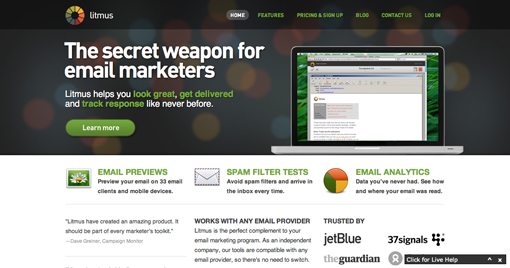
Obviously, you can’t test every client. If you’ve got the budget, sign up for a month of a service like Litmus during the testing phase. This will allow you to quickly get a preview of the finished product on 33 different email clients and is one of the best ways to ensure that everyone is covered.
During the design stage, be sure to check out The Email Standards Project. This is one of the single best sources available for detailed reports regarding what is and isn’t supported by various email clients.
#10 Use a Template
The best way that I’ve found to begin the process of designing your first HTML email is to grab a template. Even if you have a very specific design in mind, modifying a professionally developed template rather than starting from scratch can save you countless hours in troubleshooting time.This will also give you a good look into how other developers structure and style their tables. Just remember that if you’re going to redistribute or sell an email template as stock art, you shouldn’t be stealing from someone else’s work! In these cases, you’ll want to really know what you’re doing and develop your own structure from the ground up.
Free Email Templates
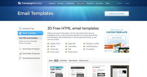
Fortunately, you don’t have to pay a dime to snag some quality free templates from which to start your design process. Most of the premium email services offer free downloads to get you started, often with no signup required. Check out the resources below:Conclusion
To sum up, when designing email templates, start with a good basic template, code like your dad did a decade ago, keep your content both conceptually and physically lean (less than 600 pixels wide), make it easy to unsubscribe and see alternate versions, and test like crazy.Leave a comment below and let us know if you found the article helpful. Also be sure to share any bits of wisdom you’ve picked up along the way for designing HTML emails.


EmoticonEmoticon